Daniel's advanced portfolio
Bonjour, This is my Ringwood media studies advanced portfolio. In this portfolio I will describe the tasks and processes we used to complete the tasks we are given.
Wednesday, 16 May 2012
Friday, 4 May 2012
Tuesday, 24 April 2012
Evaluation Question 4 - How did you use media technologies in the construction, research, planning and evaluation stages
Above is a brief overview of all the media technologies I used in the construction, research, planning and evaluation stages of my music video, below I will describe in depth how I used them, why I used them and at what stage of my music video I used them.
Facebook - I used Facebook for multiple reasons across all stages of my music video but mainly it was used for gathering audience feedback. With Facebook I could instantly gather feedback from all my friends even if I was only posting an idea, for example I posted my storyboard on Facebook to make sure it wasn't too abstract and could be understood by a wide range of people and the feedback was very positive and helped me identify the best ideas I had. In the planning stages I used Facebook to gather audience feedback on my ideas and as I moved into the actual construction of my video I used it to contact people when I was filming, it was incredibly useful to be able to contact a wide range of people whenever I needed to especially if I was on location and someone hadn't shown up. As I was editing my video I used Facebook to gather feedback on my unfinished video and obviously when I had put my final video together I used it to gather feedback for my evaluation questions.
Adobe Premiere pro - Obviously Adobe premier pro was used to edit my video together and wasn't really used in any other stage besides the construction and evaluation stages of my music video. I chose Premiere Pro because it was the most accessible, easy to use and fully fleshed out video editor we had available to us and for me just made the most sense. During the construction of my music video I used it to piece the separate video clips together and edit it changing things like colour and sound levels and I found it incredibly easy to pick up and use to a good degree. The only thing I used Premiere pro for in the evaluation stage was to make the brief video above.
Blogger - I used Blogger in all the stages of my music video and it was insanely useful for keeping all my ideas and progress in one easy to use and coherent place so that I could look at them whether at school, home or out and about filming on my smart phone. It was useful for things such as keeping videos and photos and seeing past mistakes and audience feedback.
YouTube - YouTube was great for researching and looking up the conventions of the reggae genre, it would've been much harder to gather inspiration if I couldn't actually see lots of reggae videos and other videos by directors that flared my imagination. The only problem I encountered with YouTube is that it was blocked on all school computers so I only had access to it when I was at home on my laptop and this grew to be very annoying especially in the evaluation stage so I ended up using other video sites.
Vimeo - Vimeo is one of the other video websites I used and I have to admit it really wasn't as helpful as YouTube would have been if I could have accessed it in school, however as I couldn't it did it's job well but it didn't contain the videos I needed most of the time.
Photoshop - Photoshop was used very sparingly as I had little knowledge of it and it's not the most user friendly program however when it was used I used it to touch up my digipak but I mainly had to bring in the help of more experience Photoshop users whenever I used it.
Picnik - Picnik was amazing for me in the post production of my music video as it is a very simplified version of Photoshop and even though this sounds like a bad thing it was incredibly useful to me as someone who has little Photoshop Skills and it completely served me well when I was making my digipak and poster, in the time it would have taken me to figure out Photoshop I had managed to complete my print media.
Beemp3- I used Beemp3 to download my chosen song onto any of the computers I used whilt making my music video, it was useful to have access to the song on any of the computers as it was stored on this website and saved me the trouble of keeping a memory stick with the song on it.
Google - As you thought I used Google to quickly and concisely search for and gain access to all of the above.
Microsoft Word - I used Microsoft Word to write down and keep track of all my ideas, links to videos and also to adjust my shooting schedule whenever necessary and also to keep the lyrics of my songs for when I had to go out and film.
Microsoft Powerpoint - I used Powerpoint to make presentations about my video so they could be shown to the class and on Facebook so I could receive lots of audience feedback with the aid of pictures so my ideas could be more fleshed out to the people watching.
Friday, 20 April 2012
Digipak - Final draft
This is my final draft for my 4 panel digipak, I showed it around the class and to some of my friends who don't do media studies to get some audience feedback. Currently i'm adding last minute touches to it such as a barcode to make it a more believable product.
Final Final Digipak
Audience Feedback
Sam Chamberlain - I think it's good, I really like the flower motif you have going on and it has a real bohemian feel to it.
Josh Savage - I think it's really well made and I love the flower patterns present although there is no writing on the side of the digipak and I think that would add more realism to the product
Dylan Elwell - It's pretty abstract but it all fits together well enough so that it isn't a problem and doesn't make it look terrible
Friday, 10 February 2012
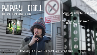
Finished Poster - Bobby Chill
Here's my finished poster for the album release, it went through three or four different versions that will be posted later.
 This is one of the other versions I created, as you can see there isn't much difference between the two posters beside's the album cover's postition on the poster, however due to the feedback I got from my class I decided to change it's position as it was blocking "Bobby Chill's" line of sight
 This is one of the other versions I created, as you can see there isn't much difference between the two posters beside's the album cover's postition on the poster, however due to the feedback I got from my class I decided to change it's position as it was blocking "Bobby Chill's" line of sight
Subscribe to:
Comments (Atom)


